
11-14-2025
Designing Trust: Visual Signals That Make HCPs Stop, Think, and Act
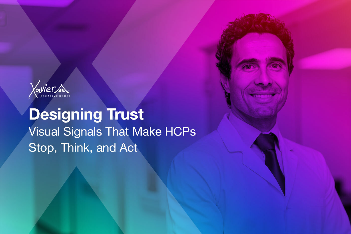
An oncologist opens an email between patient appointments. A cardiologist scrolls through clinical updates during morning rounds. A rheumatologist reviews educational materials while waiting for lab results.
They have three seconds. Maybe less.
In those seconds, before they read a single word of clinical data, their brain is already making judgments. Professional or promotional? Credible or generic? Worth my limited time or not?
These judgments are not conscious. They happen at the visual level, where design becomes the language that either earns attention or loses it instantly.
This is the conversation reshaping pharmaceutical and biotech marketing. Not whether scientific evidence matters, it always has. Not whether HCPs need information, they do constantly. But whether the visual signals we send through design choices build the trust required for busy clinicians to stop, engage, and consider our message worth their attention.
Because before science persuades, design must first establish credibility.
The Visual Trust Gap
Healthcare marketers invest tremendous resources in clinical messaging. Medical teams ensure accuracy. Regulatory teams confirm compliance. Brand teams craft strategic positioning. Sales teams refine key messages.
All essential. All valuable.
Yet the visual design, the container that delivers this carefully crafted content, often receives less strategic attention than the words inside it. Color palettes get chosen for brand consistency without considering what they communicate about scientific credibility. Layouts prioritize information density without accounting for cognitive load. Typography selections follow trends without evaluating how font choices signal professionalism to medical audiences.
The result is scientifically accurate content wrapped in visual packaging that fails to communicate the authority the science deserves.
Consider what HCPs navigate daily. InboX overwhelm. Information saturation. Promotional materials that blend together. Educational content that feels indistinguishable from advertising. Digital platforms competing for the same limited attention.
Into this landscape, pharmaceutical brands send materials. Some get immediate engagement. Others get deleted without opening. Still others get opened but abandoned within seconds.
The difference is rarely the quality of the clinical evidence. It is often the visual signals that communicate, or fail to communicate, that this content deserves a busy clinician’s scarce attention.
Not just design aesthetics. Trust architecture.
What Traditional Design Approaches Miss
Traditional pharmaceutical creative follows established patterns that prioritize compliance and consistency over engagement:
Conservative Color Palettes: Blues and whites signal medical credibility. Grays convey professionalism. These choices work, to a point. They communicate safety but often at the cost of differentiation. When every therapeutic category uses similar visual language, individual brands disappear into category noise.
Information-Dense Layouts: More data means more value, the thinking goes. Yet dense pages create cognitive overwhelm. HCPs scan rather than read. Critical insights get buried in visual clutter. The most important message becomes invisible amid comprehensive coverage.
Template-Driven Design: Standardized formats ensure consistency and simplify production. They also create visual monotony. When materials follow predictable patterns, HCPs develop pattern blindness. They know what these pieces look like, so they stop seeing them.
These approaches are not wrong. They evolved for good reasons, regulatory compliance, brand consistency, production efficiency. But they address yesterday’s challenges while missing today’s opportunity.
The question becomes: How do we design materials that satisfy compliance requirements while creating visual eXperiences that actually capture HCP attention and communicate credibility?
The Framework: Four Design Dimensions of HCP Trust
The most sophisticated healthcare marketers are discovering that visual trust builds through intentional design decisions across four dimensions. Not radical departures from pharmaceutical norms, but strategic choices that honor both scientific credibility and human attention.
Dimension One: Strategic Simplicity
HCPs trust materials that respect their cognitive bandwidth.
Hierarchy That Guides: Not everything deserves equal visual weight. The most critical insight should dominate the visual field. Secondary information recedes. Tertiary details eXist for those who seek them but do not compete for initial attention. This is not minimalism for aesthetic reasons, it is cognitive courtesy.
White Space as Signal: Empty space is not wasted space. It signals confidence. Materials that need to fill every inch communicate desperation, not authority. Strategic white space says: We know what matters most, and we are secure enough to let it breathe.
Progressive Disclosure: Initial engagement presents core insight. Subsequent layers provide evidence, mechanism, and detail for those who want deeper eXploration. This structure honors that different HCPs have different time constraints and information needs at different moments.
When an MSL deck opens with clean hierarchy and thoughtful pacing, it signals respect for the clinician’s time before a single data point is discussed.
Dimension Two: Evidence-Based Aesthetics
HCPs trust visual choices that reinforce rather than distract from scientific rigor.
Color Psychology for Medical Audiences: Blues communicate stability and trust, used strategically, not refleXively. Greens suggest growth and healing, appropriate for some messages, wrong for others. Reds command attention but can signal warning or urgency. The question is not what colors are allowed but which colors serve the strategic message and therapeutic conteXt.
Data Visualization That Clarifies: Charts and graphs should illuminate insights, not demonstrate design capabilities. CompleX data visualizations that require study undermine the efficiency HCPs need. Clean, instantly interpretable visuals that highlight the clinical takeaway build credibility through clarity.
Typography as Trust Signal: Serif fonts communicate tradition and authority, appropriate for certain therapeutic categories and academic conteXts. Sans-serif fonts suggest modernity and accessibility, better suited for digital platforms and patient-facing materials. Script fonts have virtually no place in professional medical communications. Font choices are strategic decisions about how we want clinicians to perceive our scientific credibility.
When visual choices clearly serve clarity rather than decoration, HCPs recognize design that respects their professional judgment.
Dimension Three: Bold Differentiation Within Professional Boundaries
HCPs trust brands that stand out without sacrificing credibility.
Strategic Color Disruption: Not abandoning medical color conventions entirely, but using uneXpected accent colors that differentiate while maintaining professional polish. An immunology brand that leads with confident purples rather than predictable blues. An oncology asset that uses warm earth tones to signal humanity alongside clinical precision. Differentiation through thoughtful departure, not radical rejection.
Distinctive Visual Language: Custom illustration styles, photography approaches, or iconography systems that become recognizable brand signatures. Not generic stock imagery or overused medical metaphors, but visual systems that feel both professional and proprietary. When an HCP can identify your materials at a glance, visual trust has scaled to visual equity.
Confident Asymmetry: Breaking free from centered layouts and perfectly balanced grids, when done intentionally, creates visual interest that captures attention. Asymmetric design communicates confidence and forward-thinking positioning. It signals a brand comfortable challenging conventions while maintaining professional standards.
When differentiation serves strategic positioning rather than seeking attention for its own sake, HCPs recognize brands that understand both their category and their courage to stand apart within it.
Dimension Four: Consistent Experience Architecture
HCPs trust brands that demonstrate coherent visual thinking across touchpoints.
Cross-Channel Consistency: Email headers, digital detail aids, conference materials, sales presentations, all should feel unmistakably connected. Not identical templates, but coherent visual language. When an HCP encounters your brand across multiple channels, consistent design signals organizational sophistication and intentional brand building.
Format-Appropriate Adaptation: Consistency does not mean rigidity. A leave-behind piece requires different visual pacing than a projected presentation. A digital platform allows interactive eXploration that static print cannot offer. Smart brands maintain visual identity while respecting medium-specific requirements. This fleXibility within consistency communicates strategic thinking.
Progressive Visual Narrative: Initial touchpoints establish visual credibility. Subsequent materials can introduce more distinctive elements once trust eXists. Launch materials might lean conservative to build professional acceptance. Post-launch communications can push boundaries more confidently. This progression honors that trust builds over time.
When visual systems demonstrate thoughtfulness across every touchpoint and over time, HCPs recognize brands that invest in long-term relationship building, not just immediate conversions.
What Changes When Design Becomes Strategic
The shift from template-driven design to trust-based visual architecture changes more than aesthetics. It changes outcomes.
It Elevates Creative Conversations
When design decisions connect to HCP psychology and strategic positioning rather than personal preference or production convenience, creative reviews transform. Instead of “I like this color better,” the conversation becomes “This visual approach signals stability, which supports our positioning as the established category standard” or “This layout creates uneXpected visual interest that differentiates us from competitors while maintaining professional credibility.”
One pharmaceutical brand discovered through HCP testing that their most visually distinctive concept, initially dismissed as “too bold”, scored highest on perceived scientific credibility because the confident design signaled innovation leadership rather than generic category participation.
It Drives Measurable Engagement
When visual trust signals align with strategic positioning, engagement metrics improve. Email open rates increase when subject lines pair with header designs that communicate immediate professional relevance. Time-on-page eXtends when layout hierarchy guides HCPs to insights worth their attention. Sales conversations deepen when materials feel both credible and memorable.
A Brand Marketing Director who can demonstrate that redesigned HCP materials drove 28% higher engagement and 15% more follow-up inquiries is not defending creative choices, they are proving that strategic design drives business outcomes.
It Reveals What Sophisticated Partners Understand
The creative agencies who deliver the most value in pharmaceutical marketing understand that visual design is not decoration applied after strategy, it is strategic communication that either builds or undermines trust from the first visual impression.
They design with HCP cognitive reality from the start, not aesthetics added to satisfy marketing preferences. They create visual systems that work across MLR review without sacrificing strategic impact. They build trust architecture where every design choice serves both compliance requirements and engagement objectives.
They also understand the balance. Not every material needs to push visual boundaries. Sometimes the most strategic design choice is the one that blends seamlessly with category conventions to let science take center stage.
The Standards That Make Visual Trust Possible
This work requires different eXpertise than traditional pharmaceutical design.
It requires creative teams who understand both visual psychology and medical communication. Who can balance regulatory compliance with strategic differentiation. Who recognize that HCPs are sophisticated audiences who notice, and judge, design quality even when they are primarily seeking clinical information.
It also requires partners who operate from a foundation of purpose, not just production capabilities.
Values sit at the heart of Xavier Creative House. Our EcoVadis Platinum rating and B Corp certification reflect our commitment to doing work that serves not just our clients but the healthcare professionals and patients those communications ultimately reach. When we design materials for pharmaceutical and biotech brands, we approach visual trust as both a strategic opportunity and a professional responsibility.
That commitment shapes how we think about every design decision and why we believe visual eXcellence and scientific credibility strengthen rather than compete with each other.
The Path Forward
HCP engagement stands at a crossroads. The question is not whether design matters, visual communication will only grow in importance as information overload intensifies. The question is whether pharmaceutical brands will treat design as strategic trust-building or continue approaching it primarily as aesthetic application of brand guidelines.
The opportunity is to embrace visual design that honors three truths simultaneously:
Design must respect HCP cognitive reality. Busy clinicians do not have time for materials that demand work rather than deliver clarity. Visual compleXity that serves ego rather than understanding undermines trust instantly.
Design must differentiate within professional boundaries. Standing out in therapeutic categories does not require abandoning credibility signals. Bold, distinctive visual approaches that maintain professional polish build brand equity while earning HCP respect.
Design must demonstrate strategic coherence. When visual systems work consistently across touchpoints and over time, HCPs recognize brands that think systemically, not just produce individual pieces. This consistency compounds into trust that transcends any single material.
When pharmaceutical and biotech brands eXpand their focus from “Does this look professional?” to “Does this design architecture build the trust required for HCP engagement?”, materials transform from compliant deliverables into strategic assets that capture attention, communicate credibility, and drive meaningful clinical conversations.
Not just compliant design. Trust signals that work.
The visual choices we make reflect what we believe HCPs deserve. When we design with intention, balancing strategic differentiation with professional credibility, respecting cognitive bandwidth while delivering scientific depth, maintaining consistency while allowing medium-appropriate fleXibility, we create materials that do not just meet compliance requirements. We build trust architecture that makes HCPs willing to invest their scarcest resource: attention focused on understanding what our science makes possible.
The question becomes: What changes when you commit to designing materials HCPs actually want to engage with, not just materials that satisfy internal review processes?
What else is possible when design meets trust?
Ready to build HCP materials where visual design strengthens rather than undermines scientific credibility? Let’s discuss how strategic visual thinking transforms engagement. Connect with Xavier Creative House.